Software development
The 6 best QA automation tools for 2022
Here are 6 of the best QA automation tools you can consider for quality assurance testing in your project.
Dark UI design is trendy nowadays, but there are several things to consider before implementing it on your app or website.
The "dark side" of UI design is a popular trend nowadays. This can be seen in mobile screens, TVs, and even on large-scale buildings like airports or office spaces with sleek designs to create calming environments where people feel at ease while waiting for their flights/meetings, etc.
This kind of UI UX design was never really needed before because back then, we only had black and white TV sets, so everything looked almost identical whether something happened during the day or nighttime.
With dark mode being the trendiest design choice for smartphones and tablets, many people believe it can reduce eye strain. It is also thought that it helps with battery life. Nonetheless, dark themes are usually an aesthetic choice.
For a dark theme, designers should consider their design's brand fit and cultural suitability before choosing an interface color. It's tricky to balance these factors while still achieving emotional impact with each element in your website or app.
When designing a website aimed at the general population, it's essential to consider how your content will be received by those who visit, as well as the colors you are using. The message tone should match their expectations and needs for information on this page. For instance, a dark UI design may fit a cool app intended for millennials but not for a bank's website.
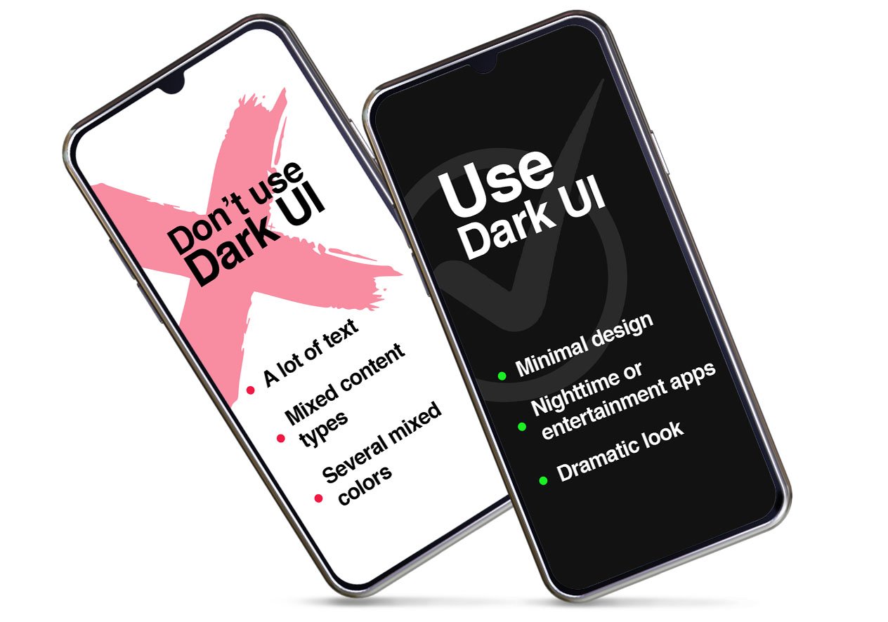
Consider using a dark user experience design when:
It is not advisable when:
Dark themes are not just black. They have to be dark enough so that visual elements stand out and the text is legible, but they still need some light from white or grey for it all to work together nicely.
Nonetheless, it is better not to use true black (#000000) for backgrounds. It turns out better in other UI elements and if used sparingly. Google recommends using dark gray (#121212) as a dark theme instead since it helps express elevation and space in an environment with a wider depth range.
The key to making your dark UI look good is to use lighter colors that contrast well against the background. You should also avoid using saturated accents or anything too brightly-colored in this type of setting, as they can appear garish when placed next to one another on a black interface.
Google has a few recommendations for dark UI color schemes, including using split complementary colors to create contrast without tension. This allows more space in your interface and reduces clutter from having too many different hues running around at once.
Read more: 10 qualities every UX designer should have
How a designer uses space to create an interface can significantly affect the user experience. In some cases, excessive negative cutting off or heavy use of black borders could make digital products appear overbearing and difficult to navigate.
The key element here is balance - the right amount will help users easily flow through your app without feeling overwhelmed.
The careful consideration of hierarchy in dark UIs can make them more easily scannable, thus elevating the user experience.
It's important to keep in mind that text size and color contrast are key factors when designing Dark UI. First, make sure your font choice is large enough so people can read it without difficulty on dark backgrounds; secondly, ensure there isn't any compression happening between what you're viewing, which would cause letter recognition problems (i.e., "l" becomes more difficult than say "F").
With the abundance of digital fonts, it's easy to make your message stand out with impact. Designers can mitigate readability issues by increasing contrast and adjusting font size for smaller text; they can also access many character spacing options.
A dark theme doesn't have to be flat. Light themes, illumination, and shading create a sense of depth in your UI design. Using only two levels for text can convey enough information without being too overwhelming or difficult on the eyes with just black lettering against an otherwise empty background color.
We live in a world with depth perception, so it is important to communicate the visual hierarchy of an interface. Many modern design systems utilize elevation levels for this purpose. A sense of depth corresponds with our natural way of seeing things and navigating through space/time.
Designing a dark UI is more than just choosing the right colors. If you want your design to stand out, it needs some serious contrast and depth, so people will notice when they're looking at them.
It's important to know the right tone of voice for your product. A dark theme can be appropriate when there is minimal content or data visualization, but it may struggle with other types, like media sites and entertainment platforms that have lots going on.
The key is simplicity. Dark UI design is excellent for minimalist content, data visualizations, entertainment platforms, and media sites. They do not fit well with data-heavy B2B platforms, pages with a lot of text, and varied content.
Schedule a free strategy session so we can discuss your UI UX project and how to boost your team’s scalability.
Here are 6 of the best QA automation tools you can consider for quality assurance testing in your project.
Node web developers are in charge of one of the most popular open.source frameworks today. Here are 8 skills they should master.
UX designers play a very important role in many projects today. Here we give you 10 qualities to look for when augmenting your team.